
Design Tokens at Fleetio
Design Systems
Fleetio's color palette served us well for many years. As our design system evolved, its shortcomings were clear: uneven color stops serving light-mode-only applications, built without accessibility in mind, and no defined color roles or semantic naming scheme. A long-awaited brand refresh was coming, and customers were yearning for dark mode. Time for an overhaul.
The Solution
Build a design token foundation. Refresh and solidify the Fleetio color palette for dark mode, integrate updated typography, space, borders, shadows and more — all with accessibility adherence built in.
Introduce a semantic layer with color roles and usage guidance.
Build it all into a source of truth that keeps design and code in sync, and ship it all without disrupting our customers' operations.
Role and Team
I owned the final color palette approval, token system architecture, color roles and semantic naming schema. I lived in the code migrating legacy color references to our new semantics, and led the testing and release efforts for the brand refresh and dark mode project.
I worked together with our principal designer Koy and brand designer Lindsey on the color palette and dark mode tuning; our principal engineer Ham on implementation strategy, and front-end engineers Blake, Jack and Steven whose token sync scripting, theming, and color-generation work all sit on this token architecture.
During this time, I was a Senior PD embedded in multiple product teams with no official design system responsibilities. The DS team was formed from this and other system work in May 2025, and I took it over as the first dedicated DS team lead in August.
Setting the stage
In January 2021, out of curiosity, I explored what an accessibility-minded color palette could look like: identical lightness steps per hue, full range from white to black. It was shared, but never meant to be a priority. It did, however, become the seed for what was to come 3 years later.
Talks of dark mode and improved color accessibility continued through to February 2024 when our principal PD, Koy, began a more concerted effort to modernize our gray color specifically. Crucially, we decided to introduce a new dark gray-975 to mirror the existing light gray-25. This allowed a full, evenly stepped lightness ramp, and to migrate our existing grays, we had to re-map some of our darker shades so existing designs and production UI wouldn’t change more visually than necessary.
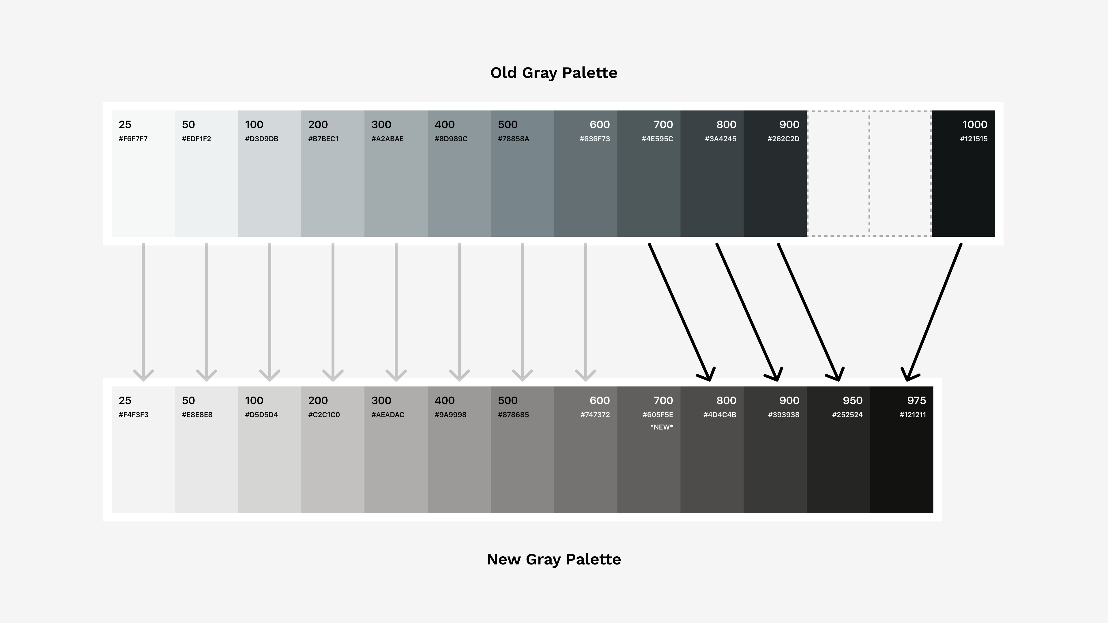
Old vs new gray color values, showing how they were remapped
Fleetio's brand design lead, Lindsey, gathered Koy and I in April 2024 to discuss darker green website concepts, and because we all share the same color palette, they wanted us to put together a new set of green colors to accommodate the design direction they were headed. Using the new gray lightness stops, we straightforwardly put together the updated color scale using the same hue angle as the existing green. Just like gray, we had to re-map and rename colors to keep existing color values from shifting too much and causing accessibility issues or customer complaints.
When it came time to implement these color changes in the codebase, I took it upon myself to conduct the migration. It was tedious keeping track of which colors needed remapping, but a carefully planned out migration strategy kept me on track.
Feels like the ball is rolling now, right? Top two colors modernized using a repeatable process, PR is open, things are starting to move.
Understanding the problem
Just because you're motivated and driven to ship a PR doesn't mean it'll hit production any time soon, especially with a PR that touches 327 files owned by several separate product teams. The PR was opened March 15, 2024 and over the course of 7 weeks, we went through a few rounds of testing, but it mostly sat there waiting for owner approval.
It also felt delayed by the fact PR didn't originate from a product team roadmap, and the design system team/dedicated designer didn’t exist yet (this PR is part of why it eventually did). We were still over a year from the official DS team giving initiatives like this the weight needed to get them into production in good time. Ultimately, the new gray and green colors were merged into production on May 14th, with 8 approvals coming in the last 5 days.
The next day the CX team reported a regression, hard-coded HEX values had leaked into the API layer and ended up blanking out vehicle status colors. It was a quick fix, but goes to show that without a system, the palette is a tax on every change.
Rebuilding the palette
Product roadmaps remain the priority through the summer, and there weren’t any substantial color conversations happening until October. The brand team is back with another round of design concepts — and a real spark.
Lindsey presents us with darker website mockups with teal elements and intriguing cooler green elements. The fresh take on our legacy green felt really promising as a way to start evolving and personalizing the product UI itself. We knew it needed to make it in. Integrating the cooler greens into the palette was a fun challenge, and we considered two approaches:
- Adjust the existing teal hue to shift more green, getting close but not exactly matching the concept designs. Leave the green alone.
- Shift the green hue slightly cooler to cover the exact colors the designs use, and leave the teal colors alone (just modernize to new lightness values). This changes greens everywhere.
After working through the possible directions, we decided on approach 2, but with an important adjustment. We didn’t shift every green value cooler, instead we gradually shifter the greens cooler as they went darker above green-500. This let us leave the lighter, brighter greens alone, as they are important to convey status and successful intent around the app. We were psyched with the new green, and promptly updated the color values in Figma and the codebase. Teal followed suit.
Now with 3 of our hues finalized, the ball is officially rolling. The remaining colors were knocked out within a couple weeks: blue, purple, red, pink, and yellow. Blue and purple used just about identical lightness and saturation curves as green & teal. Red and pink had slight adjustments to brighten middle values. Yellow is always the fun one, its curves were significantly different, saturation remained just about pegged to 100%, and to avoid the muddy dark yellow colors, we shifted the hue more orange as the colors darkened.
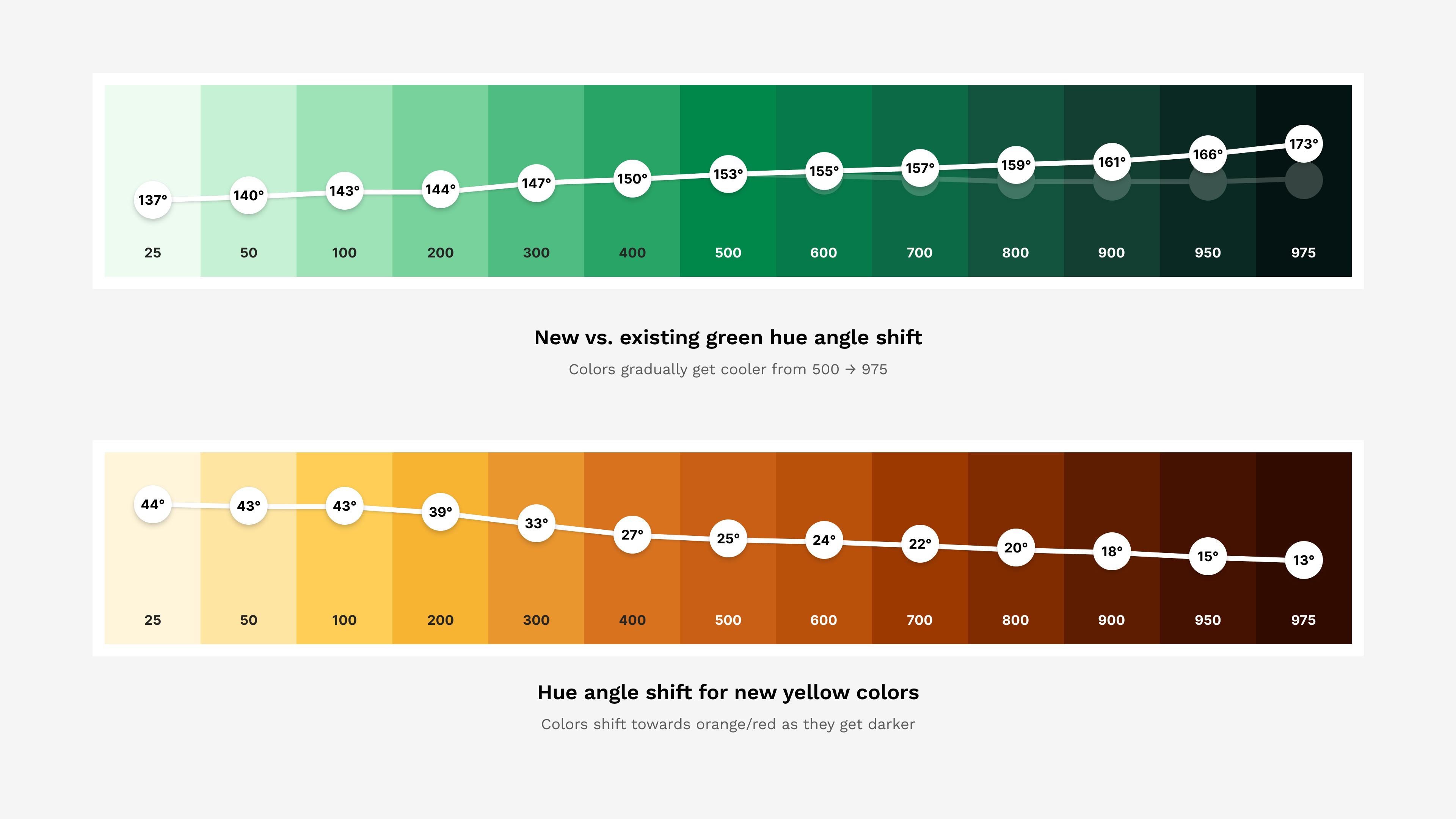
Comparing the two curated hue angle shifts in green and yellow
Accessibility was built in to the palette, we ensured that our primary xxx-950 and secondary xxx-600 text colors remained WCAG AA 4.5:1 contrast compliant against our primary white and secondary xxx-25 surface backgrounds. Dark mode was also being considered at this time, and we made sure light-on-dark colors worked, too.
The updated Fleetio color palette was finalized on March 6, 2025. It may have taken the better part of year to get there, but the end result was something we were all proud of.
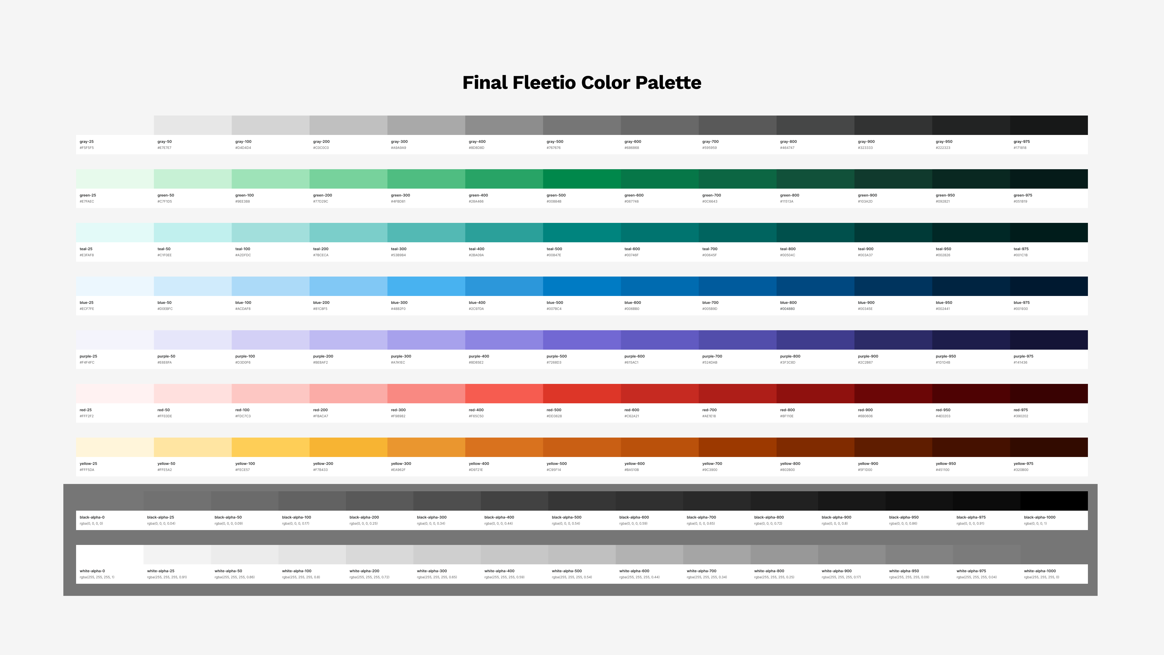
The final Fleetio color palette (click to zoom)
The next phase begins
A comprehensive color palette is great on its own, but in order to take advantage of the full spectrum of lightness values we settled on, we need to talk semantics. We have the full set of primitive HEX codes defined as variables in our standalone Fleetio Colors library — the main source of truth for all color at Fleetio. We deprecated the old Figma color styles and variables became the only way to pick a color. The brand and marketing teams reference this palette in their own libraries.
This is not to say that the colors are now untouchable, we still poke and prod HSL values every once in a while, but the value steps are likely not changing anytime soon.
At this point we've also updated all color values in our codebase and Tailwind is referencing them properly. With the primitive tokens established, we're ready for the semantic layer to finally unlock the theming power of design tokens.
Color roles
The naming schema of semantic tokens is one of the most important pieces of this puzzle to get right. Thankfully design tokens have been a thing for over 12 years now, and there is a trove of helpful information and inspiring examples out there. One thing you'll find, is that in order to name your colors, you need to give them a role. The role allows the semantic token to describe the job of the color it provides, instead of the appearance. If you want to have theming—like dark mode—in your application, you need the token's role to represent multiple values.
We settled on a fairly straightforward set of roles, which we have been using to describe our colors in certain contexts, like: red buttons mean 'danger' and yellow flash banners mean 'warning'. In addition to transparent and inverse, there was one net-new role we added—brand—that proved to be a key piece in the puzzle that was the upcoming brand refresh initiative.
Next you need the application layer for the color roles, the actual UI elements that display the color. Koy and I had been quite fond of Shopify Polaris' token system, and their schema ended up being a huge inspiration, especially regarding the color application names. Adopting this new system meant thinking about color usage around Fleetio in a new way.
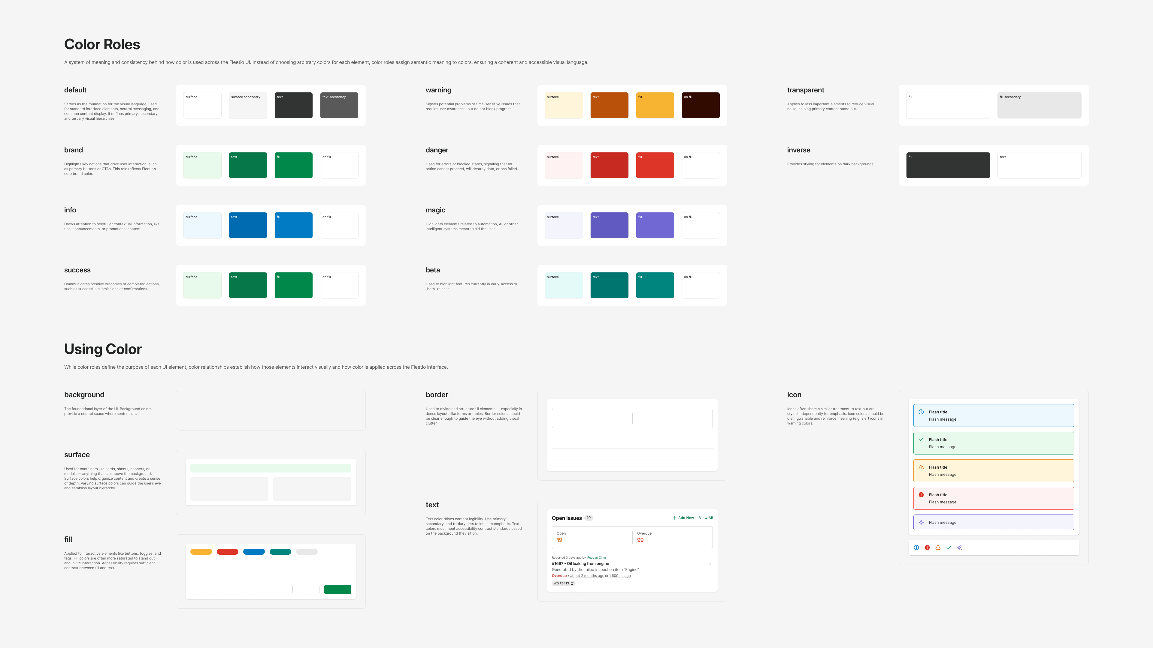
Fleetio's color roles and usage guidelines (definitely click to zoom in)
Now, with the role and application understood, we have to expand those into their various alternate uses. Colors in Fleetio are not static, they are dynamic, they change with component states and are often layered throughout the UI. So each token has modifiers to adapt it to its context.
Some modifier examples:
- primary, secondary and tertiary: Used to denote the token's emphasis. For example default light mode backgrounds go from
white→gray-25→gray-50 - hover and active: Self-explanatory, these tokens are used for hover and active states for interactive components.
- on-bg-fill: A very helpful token modifier for text and icons displayed on a
bg-fill-{role}background. These tokens ensure proper contrast when displayed on the more saturated fill colors.
We now had all the pieces we needed to define our semantic token naming schema: {application}-{role}-{modifier}
Semantic tokens in Figma and code
Altogether, we created over 140 semantic tokens, and they were each assigned light and dark mode values. Determining the actual values to use was a significant undertaking on its own. We were able to define a majority of the tokens right away, as they were pretty much defined by their roles and color contrast requirements. The neutral background colors proved to be the trickiest ones. For example, the foundational background color in light mode is gray-25, on which we commonly display cards, which have a white background. However, in dark mode, we found that a gray-975 background with gray-950 card surfaces worked best—an approach that is less intuitive, because it is not a simple inversion of the color values. This led to many other small token tweaks down the line.
The tokens were implemented as variables in Figma and referenced in our UI components, which unlocked dark mode for our product design team. Figma variables were organized into logical groups, e.g. color/background/surface/bg-surface-primary, color/text/text-brand, color/border/border-secondary.
When planning token codebase implementation, I realized the token names exactly matched the Tailwind utility class naming schema, which meant we could very straightforwardly extend the Tailwind config to include all of the new tokens. This was the cherry on the cake. There was no need to map tokens to different class names, and no additional terminology needed for each token. The new tokens/utility classes lived right alongside the existing color classes, primed and ready for the upcoming theming push.
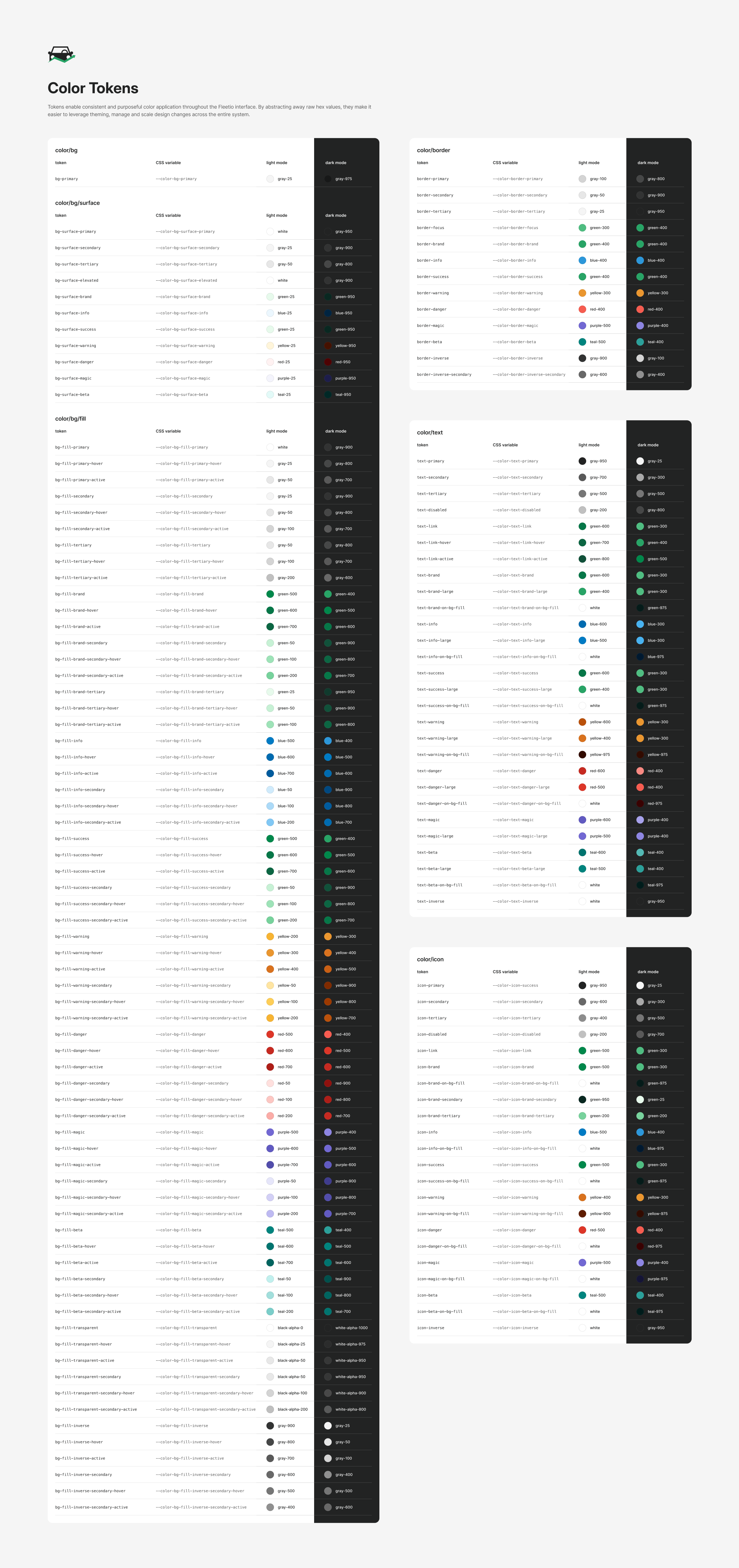
Fleetio's complete color token family (click to zoom)
The rest of the foundations
While it's definitely the bulk of the design token work, colors alone don't a token system make. Typography tokens are the next most important inclusion in the system. We introduced semantic token Figma variables for all font properties: font-family, size, line-height, weight, and letter-spacing. These were combined via Figma text styles into 3 hierarchical variants: body, heading, and display. A t-shirt sizing system was used for size tokens as well as the variants themselves. body variants are the main UI type styles, display variants are seldom used large type styles for hero banners and unique needs, they both get 3 weight options per size. heading variants are locked into semibold only, as they are reserved for page/section headings in the UI.
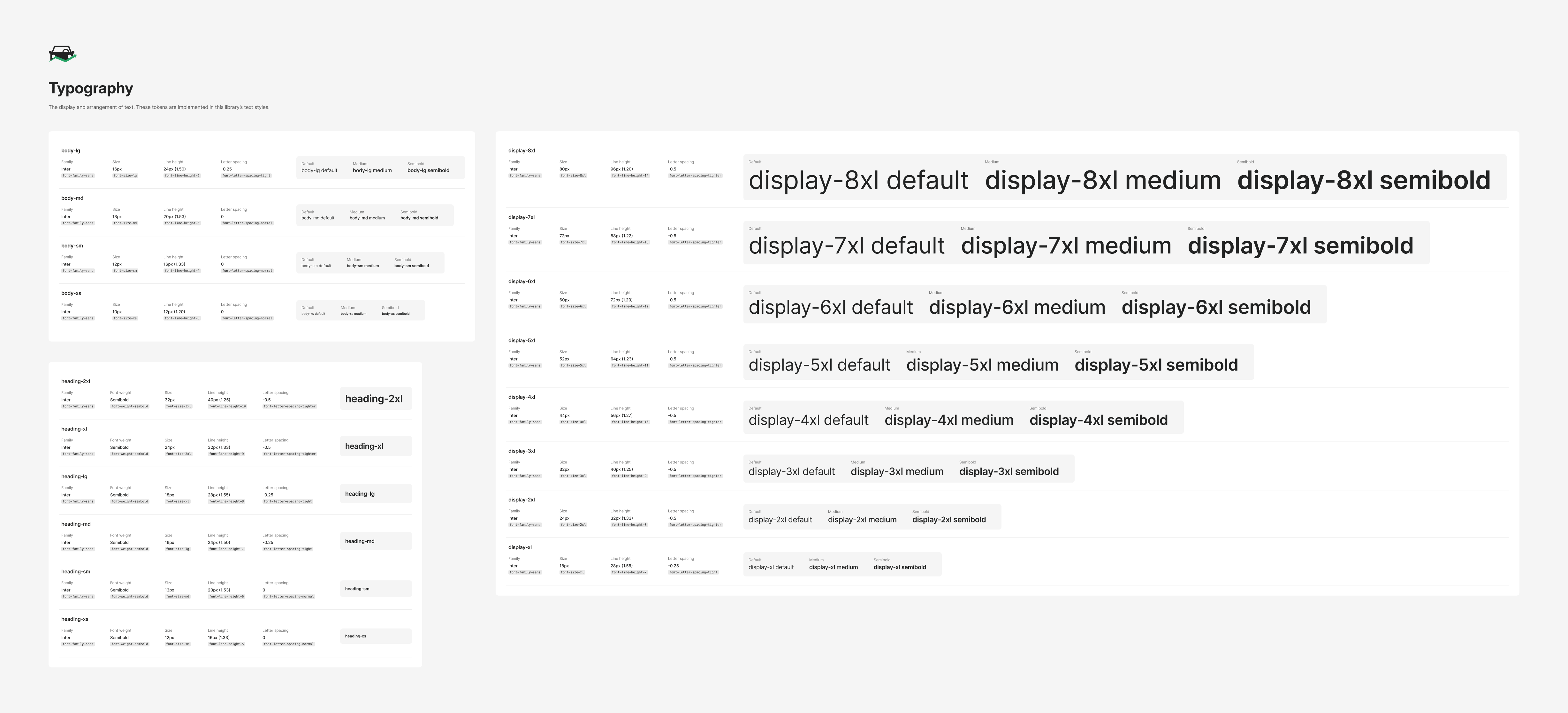
Fleetio's product UI typography tokens (click to zoom)
Since typography styles are made up of multiple semantic token layers (size, weight, line-height, etc) and text themes were a separate dropdown in Figma, we needed a way to let designers efficiently apply the style into their designs, and swap between them easily. A refactor to the <Text/> React component was on the way, so in anticipation, I built out a Text component in Figma with an API that could match the future React component. This allowed designers to play with and get used to using a component for copy in their designs. Swapping weights, variants and themes became simple property dropdown options. There were a couple trade-offs with a component-based approach in Figma, such as losing the ability to use multiple styles/themes in one string of text. However, the beauty of the underlying token system was that, even if the component or text styles were detached, the text properties and color variables were still linked to their individual tokens.
Figma components were updated with these new token variables styles, and I held office-hours to help designers transition to using the Text component, as well as to gather feedback on any limitations/issues that arose.
The remaining token families we included were: shadow, border-width, border-radius, and size/space. Shadows were built as effect styles in Figma and box-shadow attributes in CSS. Border attributes were already established, so they just needed the tokenization treatment.
In Figma we created private primitive size variables (not meant to be exported to code), which provided a standard sizing scale to the actual primitive space, width, and height variables. Tailwind uses those 3 variable families to build out all of its various space-based utility classes, and Figma separates variable scope into gap (space) and height and width.
With all of that established, the full system of primitive and semantic tokens was solidified. Just in time for their biggest test.
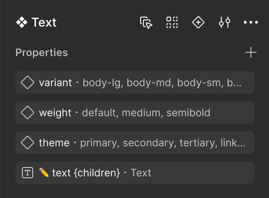
Figma Text component properties
Shipping in disguise
By April 2025, PMM and product leadership decided that the two token-related initiatives, web app brand refresh and dark mode, would launch together in late May.
Now, dark mode started out as an experiment using Tailwind dark: class prefixes, which meant each element that had a color class would require a second class for dark mode (e.g. bg-gray-25 dark:bg-gray-950, text-green-600 dark:text-green-400). This doubles every color decision, and completely ignores the semantic context.
Using the new token system, our semantic-tokens.css file listed each token twice; once for the default light mode, and again for dark mode. This meant that in order to get dark mode, we just needed replace Tailwind color classes to the new semantic versions (e.g. bg-gray-25 → bg-surface-secondary, text-red-600 → text-danger). The tricky part was that there were more than 250 classes that needed replacing, as well as random leftover HEX codes to find and deal with. It needed to happen, and over a few PRs, I was able to update all of them. One of the trickiest problems to deal with was determining a color's context. Many tokens share the same underlying value, but have separate contexts. I needed to make sure I was careful to choose the appropriate token per application. An exception to dark mode was the onboarding flow, which was very image-heavy and had a separate UI. Dark mode would arrive for onboarding later in the year.
The web app referenced our semantic token file to enable dark mode via :root variable definitions and body[data-theme="dark"] targeting to determine if light or dark mode variables should be presented. We shipped dark mode behind a feature flag, allowing folks to test it out internally and find places we missed or otherwise needed attention.

Four of the products we researched
Launch day
The real breakthrough came when we needed a way to test out the brand refresh in the web app before it became public, too. If you recall, we introduced the brand color role with our token system. My suggestion was another set of overrides in the semantic tokens CSS file. This set would specifically target brand role color tokens. In the full token set, brand tokens were mapped to new green colors, and a small set of overriding variables would apply the existing legacy blue colors. During the Tailwind class migration, many instances of blue color classes were migrated to brand semantic classes. This meant that those instances would by default reference new green brand colors, but the overrides kept them blue. For internal testing, a simple feature flag added a class to the <body/> tag, which disabled the blue overrides, revealing the new green aesthetic across the full web app in various components like buttons, links, tabs, tags, and focus states.
The day before launch, I built out the new Fleetoglyph React component. Fleetoglyphs are our mid-size illustrations used commonly for empty states. Instead of maintaining 2 sets of SVG illustrations—one for light mode, one for dark—I found a clean way to utilize our design tokens (with HEX code fallbacks) in the SVG markup. The Fleetoglyph React component then rendered the SVG code in a way that accepted the CSS variable tokens. This all meant they flipped between modes perfectly.
Launch day, May 27, 2025 came; the brand refresh and dark mode project was ready for release. Removing one feature flag and deleting the overriding blue brand token variables was all it took. A simple PR was merged, and everyone was seeing green.
Four of the products we researched
Four of the products we researched
Keeping it true
The design system team had become official in the days before launch, and soon afterwards our three new Figma libraries were officially launched to designers: Design Tokens, Components, and UX Patterns & Templates.
Then came a 2 month break in the action, as we welcomed our 2nd baby boy into our family June 6th. Returning from leave the first week of August, I officially took control of the newly established DS team at Fleetio.
Figma's intuitive variable organization system proved itself, and we decided to make it the design token source of truth. In order to solidify this decision, Steven, the DS engineer built a Figma → CSS Design Tokens script that took the exported Figma variable JSON, ensured it's conformance to the emerging Design Tokens Community Group (DTCG) standard schema, and using Style Dictionary, generates new and updates existing CSS variables.
In the ensuing months, our token system expanded to include various secondary and tertiary variants. It also went through a significant contraction on the color front in November 2025 as we deprecated the pink hue from Fleetio altogether. It was only every used in a couple places to indicate new table columns or index views. Earlier in the color palette development, we expected to define a "New" color role for pink. However, we never found other use cases for the color, and it felt out of place. We removed the hue family from our color libraries and migrated existing pink UI elements to our yellow "Warning" color role.
In January 2026, senior engineer, Jack, built a theming tool utilizing our semantic tokens to generate completely different themes for our enterprise and white-labelling partners. Another win for the "brand" role and the extensibility of the CSS variables.
In February, staff engineer, Blake, migrated us to Tailwind v4, a big release which changed everything to a CSS-variable-native theming system. Our existing CSS variable tokens made the transition a much smoother process.
In March, principal engineer, Ham, developed OKLCH color scale generation which could take a partner’s brand color or logo, and generate a complete accessible brand color palette and full application theme, a powerful offering for our highest-paying enterprise customers.
In July 2026, I shipped a much needed refactor of our React component. We had established our icon semantic color tokens a year earlier, but the icon component never actually referenced those tokens. The updated component now accepted the color roles as a property value, and icon colors around the app were updated, improving color contrast accessibility.
For a few weeks, the refactored component API still allowed the existing text-color Tailwind class names as color values. In a single PR in August, 682 color prop values across 392 files were migrated from text colors to icon colors. An extensive mapping table was generated to document and verify all of the visible color changes. Only 2 mappings, text-primary and text-inverse, didn’t actually change. In general, the icons’ color contrast dropped because minimum AA contrast for graphical elements is 3:1. This meant the brightness and saturation increased — an improvement for icon visibility and communication of their intent.
Measuring success and next steps
Then and Now
March 2024
First palette change (gray and green)
August 2025
Icon color migration
327
files touched
392
files touched
682
call sites
60
days open → merge
1
pull request
8
approvals needed
13
colors approved before merge
1
regression, next day
0
reported regressions
The first time I changed just two colors, it took a 327-file PR more than two months to get approved and merged, and it broke vehicle status colors. Two years later I shipped changes to 682 icon colors across 392 files in one PR, and nobody noticed.
The web app today (as of Sept 2026)
3687
semantic color references
124
raw palette classes remaining
6 token families • light + dark + 4 enterprise themes • 7 hues
As it stands, the system is made of 123 color tokens + 93 other primitive tokens + 164 semantic tokens serving light + dark + enterprise themes. The Fleetio mobile applications share color values and primitive tokens, not yet aligned on semantics.
Next steps include: tokenizing chart colors, integrating mobile into the token export pipeline, and updating system components to move from Tailwind color classes to design tokens.
Closing thoughts
While the outcome is certainly successful, there were many ups and downs, false starts, and delays along the way. There were also bits that fell through the cracks.
I mentioned the icon color tokens and how even though they were purposely designed for graphical elements' differing contrast guidelines, we didn't actually start using them for over a year. The existing <Icon> component just used text-xxx color classes to style icons, and it wasn't until July 2026 that I refactored the component to use those tokens. In retrospect, there was no reason to wait so long, especially with designers using the tokens that whole time in their Figma designs.
Another thing we missed was the mysterious disappearance of our black-alpha/white-alpha primitive tokens and their associated transparent role semantic tokens. I had no clue what happened, and I honestly felt like I was insane, because there was almost no trace of the alpha tokens anywhere. I remembered that I used them in our <Tag> component, and sure enough there was a broken reference to a transparent background color. After some investigation, I finally realized we had added those tokens manually into the code, and so when we started the automated token export from Figma, the alpha tokens were overwritten. It was a quick fix, thankfully!
Now looking back, there is one thing I'd change. I spent most of this entire 2+ year process as a PD embedded in product teams, squeezing progress between roadmap items. I should have pushed harder for a design system team a year earlier so I could prioritize and be dedicated to the token work. Well, the system held up anyway. Theme switching worked the first time we flipped it, we've added and retired tokens since without anyone noticing, and the last migration was 682 call sites in one PR. Nobody noticed that either, which was the point.