Volusion Rebrand
Creative Direction
Volusion has helped thousands of businesses successfully launch and grow their online presences, but by late 2016 it was apparent that the Volusion brand wasn’t growing at the same pace. This, coupled with the fact that the corporate culture was starting to change, lead us on a quest to develop an identity the company could rally behind as it progressed into the future.
The Solution
We gathered a team of eight designers and content creators and began our efforts. Over time, we ended up involving the whole organization in idea generating exercises, and ultimately brought in a creative agency to help push us over the finish line.
My Role
Design Lead in charge of creative direction, as well as organizing design reviews and creative exercises. I also headed up the efforts to bring in the creative agency, and became the point of contact during all phases of that relationship.
How one software company
overhauled its old school vibe.
Following Volusion’s brand redesign from conception to implementation.

This pretty much sums it up.
Author's Note:
This case study was first written as an article published in May 2017.
Read the article on Medium >>
Volusion has a long and vibrant history as one of the top ecommerce software websites on the web.
We were created in 1999 by web designer Kevin Sproles, who was just 16 and working out of his parents’ house. Since then we’ve never been an average company…but in late 2016 we realized that our site was looking decidedly average. As designers we felt like our old brand was not very well developed or clear, and was lacking in personality. We knew that we could improve the brand and website to attract our ideal customer.
Volusion's existing logo and homepage
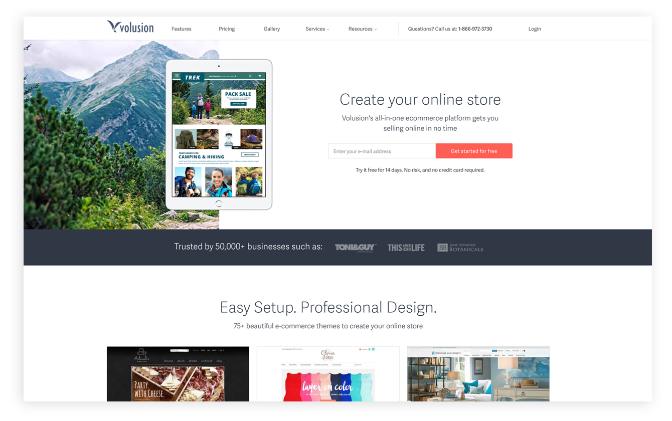
So we decided to totally revamp our website and brand, primarily to attract new merchants and help foster the talents of amazing ecommerce founders. Additionally, we wanted to create a more fresh look that could easily grow and develop with our current and future customers.
Getting Started
Volusion’s redesign team consisted of six designers across the company and an external freelance designer. We looped in everyone with design experience — not just the folks in marketing — because we wanted as many perspectives as we could get. Two of our designers work directly with our customers on a daily basis, and understand their needs. The others are from the marketing and product teams, and have a historical knowledge of what elements of our website would keep our conversion rates on track. The final designer was under contract, and had a great outside perspective on the brand.
Our homepage redesign kickoff was in early November 2016. The first goal was to explore new layout and styling options, and to then user test them. By narrowing the design focus down to just the homepage we were able to explore a larger variety of options in a two month period.
The initial redesign process was pretty straightforward for a few weeks. We met once a week to review various homepage designs, gather feedback and share user testing results. Eventually each designer came up with their own concept for the homepage.
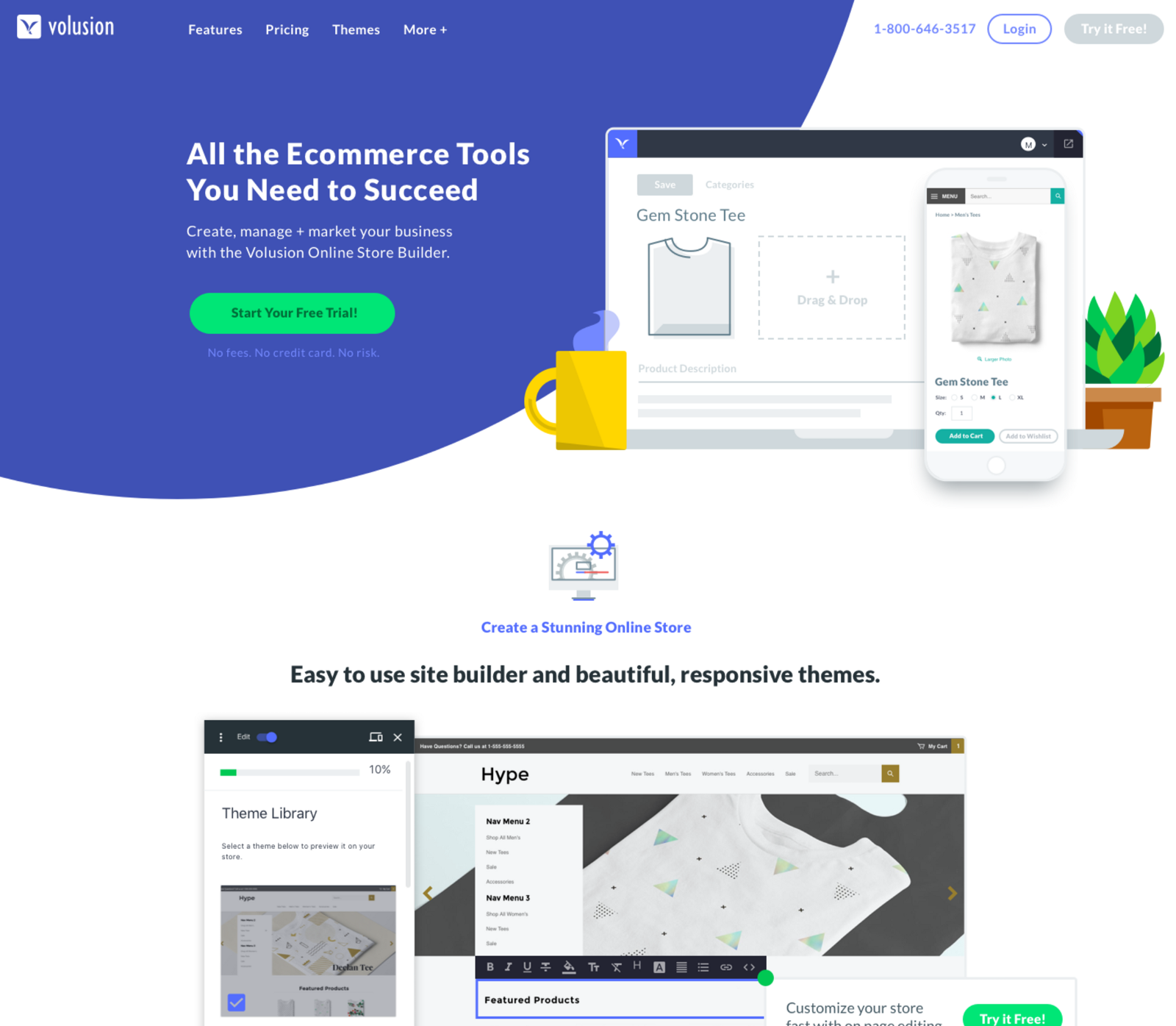
Concepts from different designers
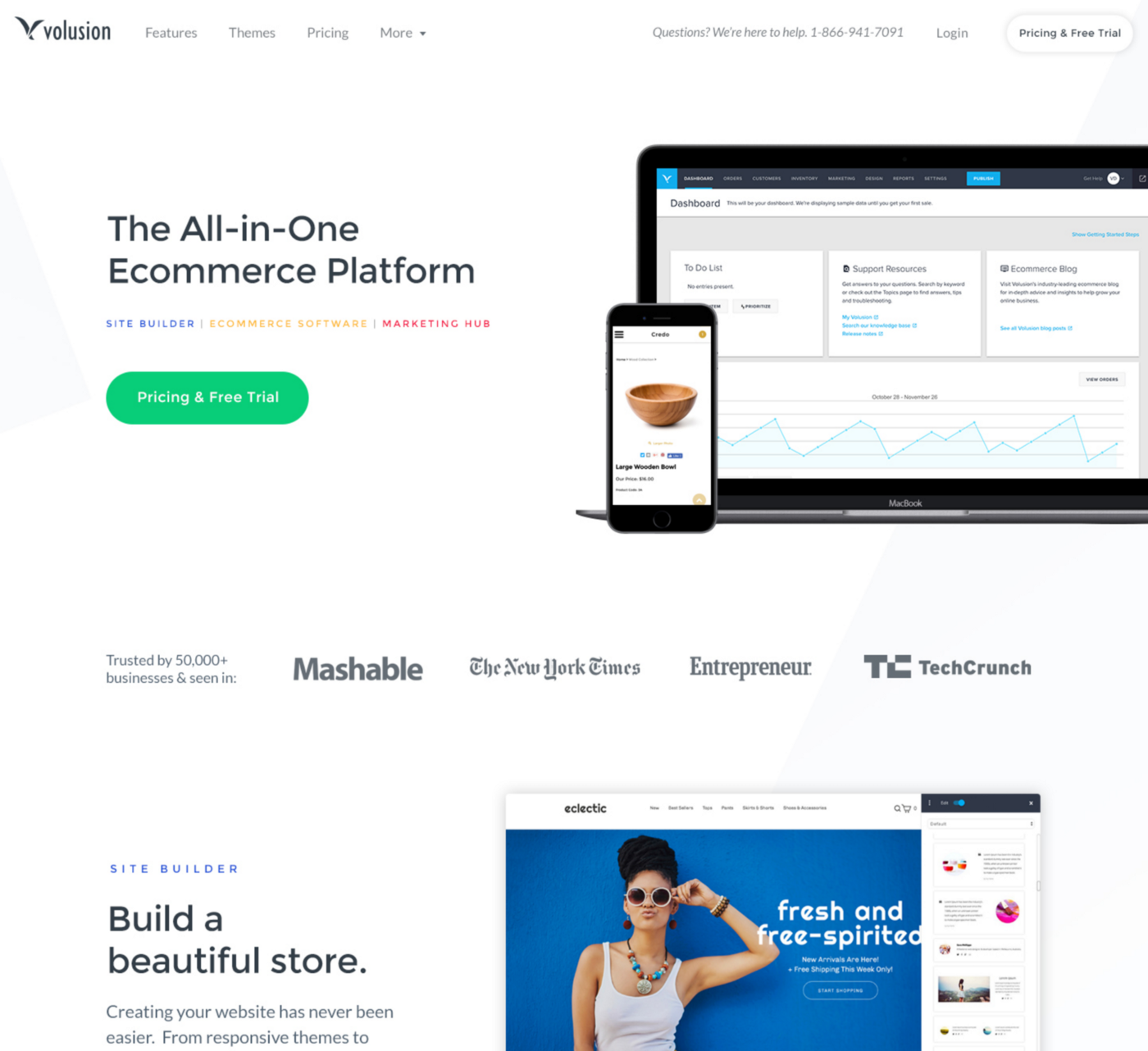

There were no restrictions on the design process; we wanted to give everyone creative freedom. However, we did keep in mind our main homepage goal: introducing new customers to Volusion and enticing them to sign up for a free trial.
Next Steps
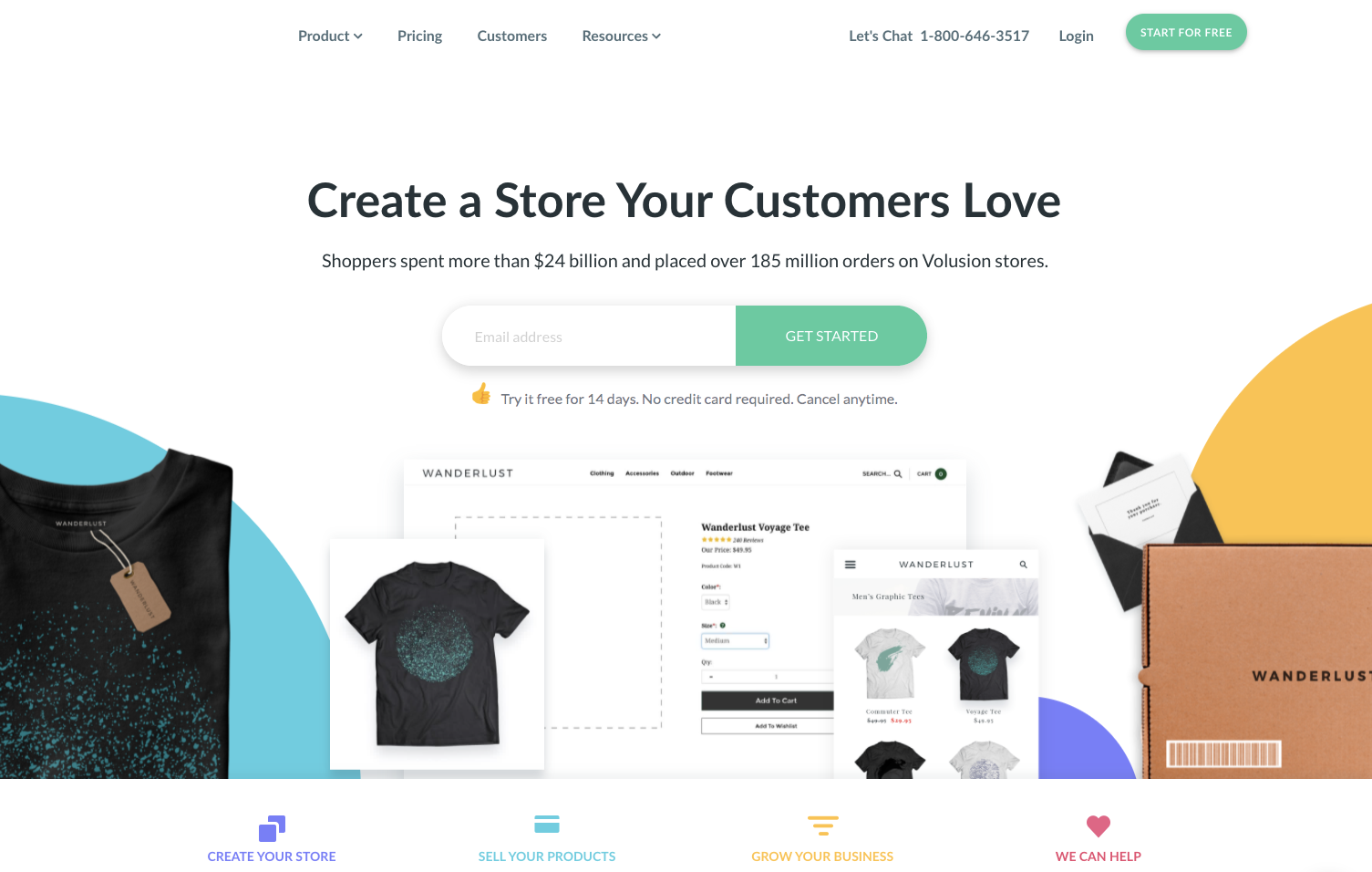
After a month and a half of design work and four rounds of revision, we finally narrowed it down to our two favorite concepts. These borrowed the best elements from various designs our team had come up with. We also did user testing on content and design to see what resonated, and from there we were able to develop one cohesive look that was to become our homepage.
Missing something?
Creating a Fresh Logo
We initially didn’t even plan for executing an entire rebrand, But by late December we realized that the need for an revamped logo — and overall site — was apparent. Eventually our weekly meetings took on a rebranding focus, and revolved around compiling a style guide and conceptualizing new logos.
To create a fresh logo, we looped in the same designers that participated in the homepage redesign, and once again everyone developed their own concepts. We also put up an ideation board where the rebrand team posted their contributions, which was placed in the office lounge for all employees to see. This corresponded with a public Slack channel called #rebrand-feedback, where we encouraged any and all opinions about the logo concepts.
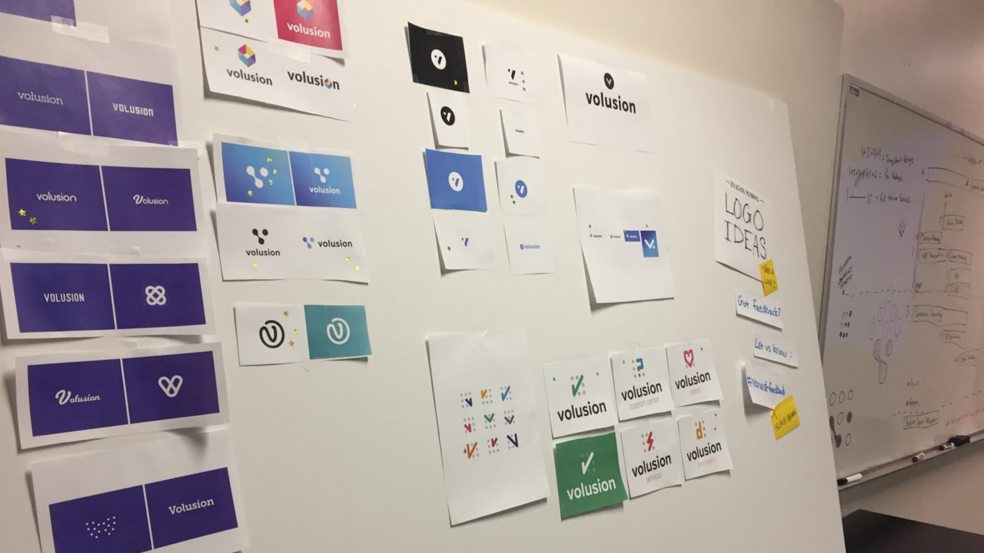
Early logo exploration
Collaborative Design
In a fun move, we also let all other employees in the company submit their logo ideas. In early January we wrangled the entire office into a company brainstorming session. Here Kevin directed everyone to draw symbols that embodied the idea of our primary goal: to help founders achieve their goals. Various departments worked together to draw up ideas on Post-it notes, creating a smorgasbord of fun and colorful ideas.

Every post needs a shot of Post-its on a wall, right?

We believe in sharing openly and being transparent (it’s actually one of the tenants of our Culture Code), which is why we had everyone contribute ideas related to Volusion and what we do for our customers. Additionally, it was interesting to see the symbolism that non-design teams suggested, with everything from light bulbs and plants to eagles and tacos.
At the same time we revealed our design team logo ideas to the entire company, and it was a total learning experience. In fact, a number of the logos that were popular with designers did not resonate with the rest of the employees. This wasn’t discouraging; it was actually interesting to get input from people who thought differently, and it motivated us to reach out and explore other options. We learned a lot by being transparent and opening ourselves up to feedback.
Changing Direction
After the company brainstorm, the design team generated even more ideas and shared them with our employees. However, nothing was sticking. Eventually we decided to seek outside help for generating concepts we had not yet explored. In early February we reached out to Ramotion, who have established themselves as a respected branding and UX agency on Dribbble, and impressed us with their logo and brand work.

With a new team on our side, we came up with twenty main attributes to describe Volusion, and for each attribute we had five supporting descriptions. It was at this step is when the concept of a prism first came to light. (Pun intended.) We narrowed the list down to our top five favorite attributes, and Ramotion sent us back basic sketch ideas.

A refreshingly diverse selection of sketches

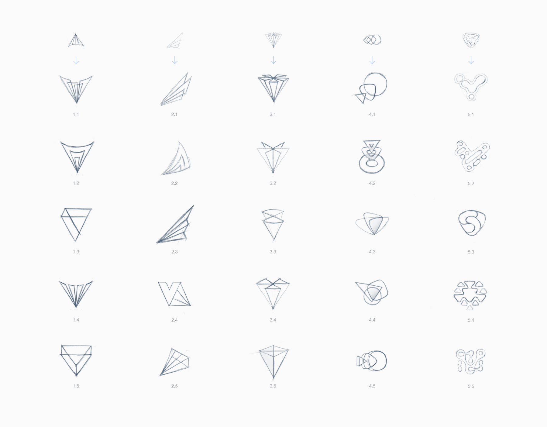
We set an aggressive timeline for logo completion in under a month, which meant we were both getting daily updates from the Ramotion team and giving daily feedback. Even though we had a time crunch, within two weeks we were able to narrow down our ideas to a few unique concepts.

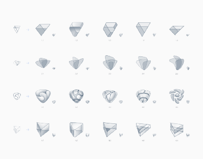

A formal logo design process, especially one restricted by a tight deadline, can be very laborious. A brand redesign commonly starts with an abundance of enthusiasm, but as the project moves on, that enthusiasm can dwindle and the elusive final result can seem out of reach. In early March, this is the feeling we faced.
We really started liking the prism metaphor and how it represented our mission, but the symbol was just missing something. Even with a feeling that we may not be headed in the right direction, we persevered and gave more feedback. This time, however, we expressed our desire to start seeing some color applied to the designs.
Immediately after sending feedback to Ramotion, we pulled open Illustrator and painted in some bright colors into the leading prism shape. This changed everything.
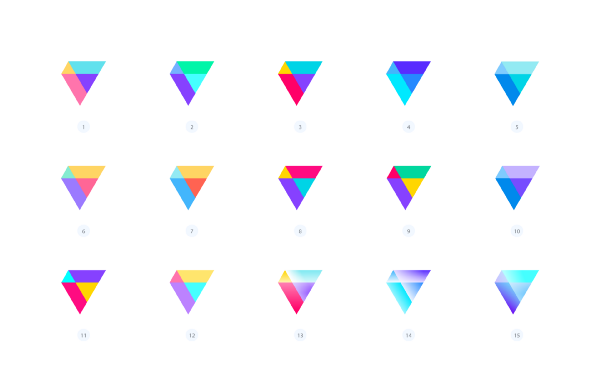
The first revision Ramotion sent that had color applied.

What we had been fooling around with in Illustrator.
It suffices to say that we were on the exact same page with Ramotion. We independently created mockups that matched up perfectly! The colors instantaneously gave life and meaning to the shape, and the brightness provided a feeling of friendliness and refreshment. All it took was to add the four colors we landed on with the homepage, and to match the more rounded, friendly feel of our overall design direction, soften the edges of the sharply pointed prism.
Consider the Prism
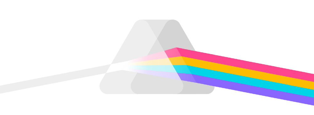
What does it do?
Transform light. A simple white light goes in, and a beautiful spectrum of colors comes out.
What does Volusion do?
Transform founders. A founder comes to us with an idea, and we transform that idea into a successful online business.
We are the prism
We are Volusion
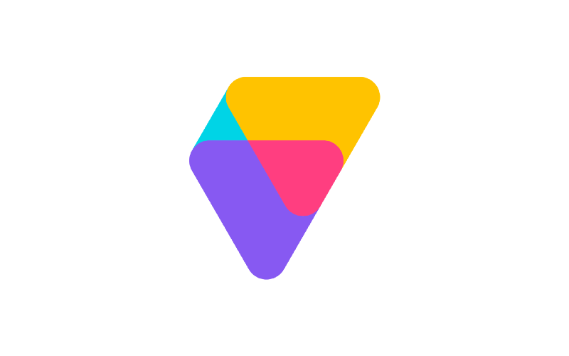
Our "Consider the Prism" story was shared with all of our employees, and we had overwhelmingly positive feedback on the brand mark idea. We finally felt like we found our best logo solution.
The Prism itself represents our customers that come to us with an idea, and who use our product and services to create successful businesses. The four logo colors represent the four facets of our product: the Create Your Store, Sell Your Products, Grow Your Business and We Can Help sections. These facets are also the cornerstones of our new website structure.
When developing the logo, it was important for us as designers to collaborate with all our employees to create something we all would love, not just as a logo, but as a symbol that we can embody and champion in our everyday lives. Luckily, our final design hit that mark: we have something that we — and our employees — are proud of.

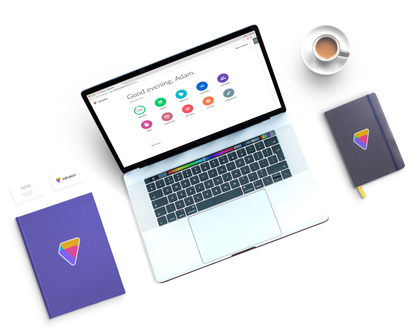


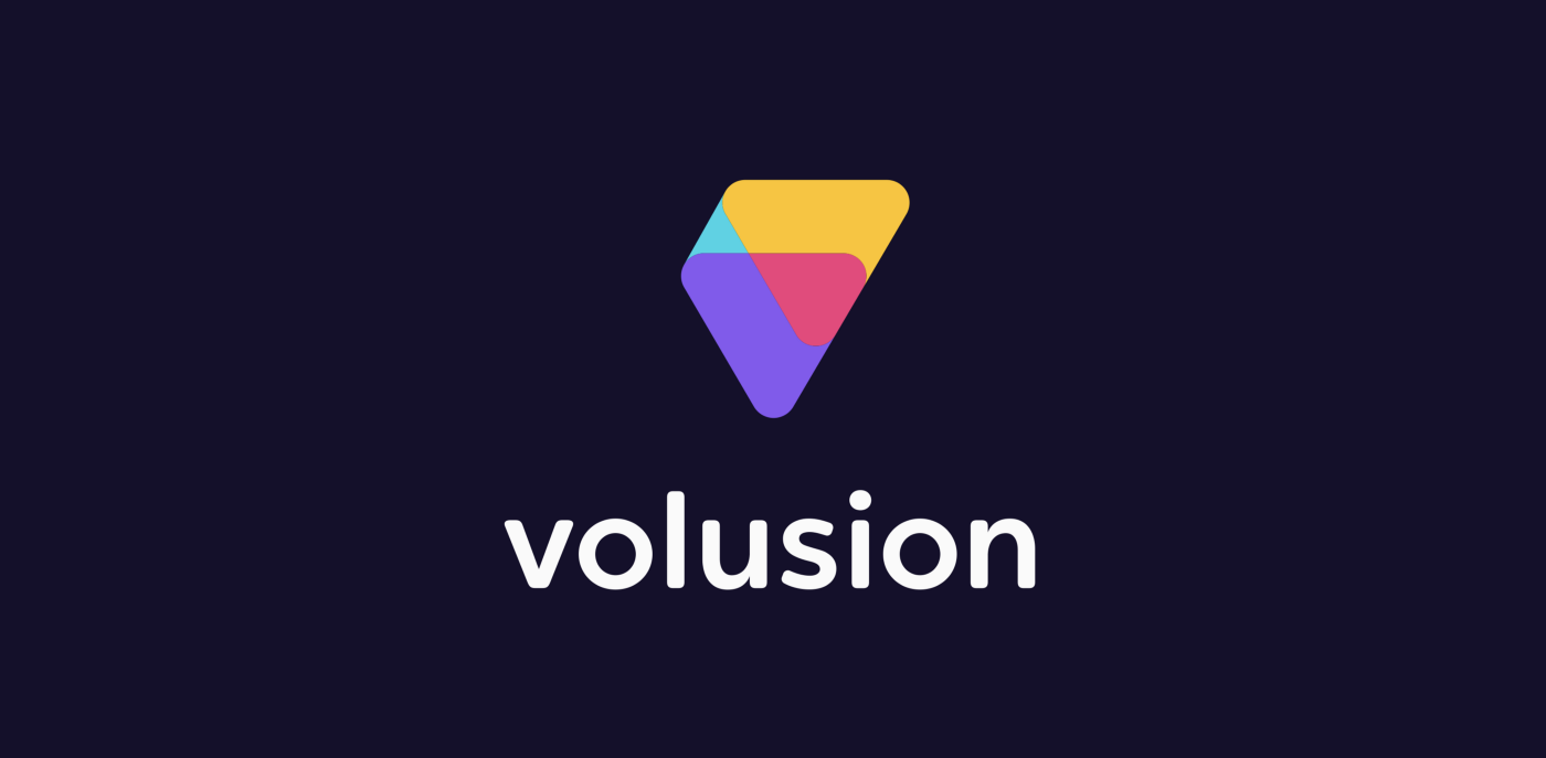
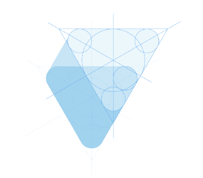
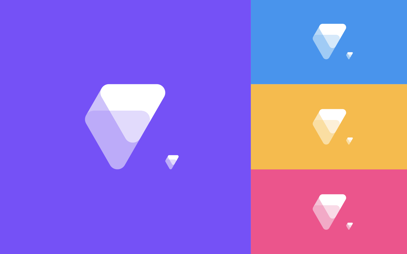
Over the next two weeks we worked with Ramotion to finalize the wordmark for the design. By mid-March we had our final logo…and celebrated with a Pink Floyd and prism-filled party, where we presented the design and handed out t-shirts with the new look.

A toast to the new Volusion!
Things We Learned
We discovered that feedback was absolutely crucial to the rebranding process, and that it was important to get it early and often. Because we shared our ideas and got honest input throughout our process, we were able to achieve a better logo solution that everyone loved. And since we shared early in the process, we were able to pivot and change direction without losing ground. We learned something new each time we shared our ideas among the design group, and especially among our fellow Volusioneers.
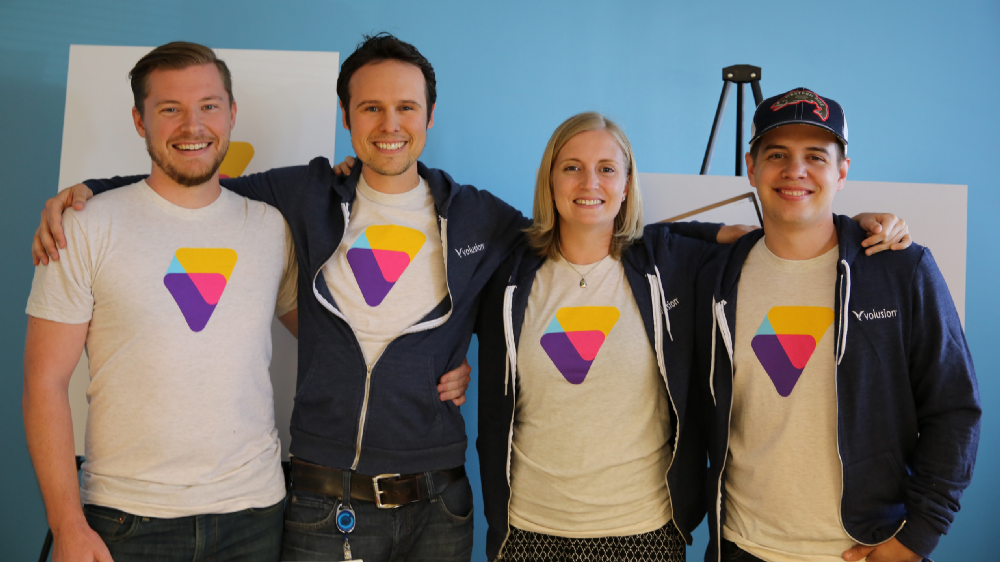
(L-R) Sr. Product Designer Adam Dutton, Founder & CEO Kevin Sproles, Sr. Visual Designer Tracy Turner, Sr. Visual & UI Designer Mike Casebolt.
Looking Ahead
Volusion’s future is looking as bright as our new logo! Our new, modern mark is representative of what Volusion is working towards as a brand and the type of product we want to provide our customers with. Having a new mark elevates our company, and we can’t wait to move forward with it at the forefront of our brand.

